
This collection of points on critiquing photos is courtesy of various experts on Google. Because of copyright issues, I have had to replace the photos used in my original club presentation with those from our own members. The ones used to illustrate poor technique I take full responsibility for!
What is a critique?
- A critique is not a criticism – it is a detailed analysis and assessment of something.
- A critique is not an opinion.
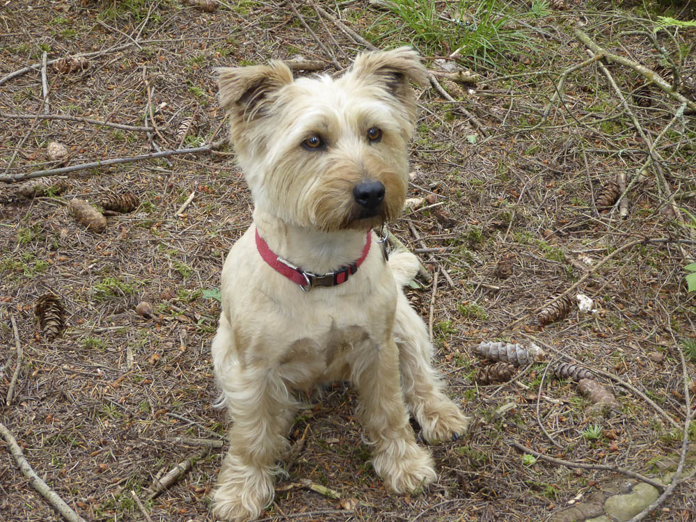
Many people will like this photo just because it is a rather cute dog, but that doesn’t make it a good photo.
- Critique is an important tool to help us improve our photography. Critique can be done by judges, by your peers, or simply by yourself. If you can learn to judge your photos objectively then your photography should improve.
Critique Tools
It can be a good idea to run through a list of points when critiquing a photograph to help you judge the photo more objectively. There are three main areas that should be considered: technical correctness, composition and subject matter.
TECHNICAL ISSUES
- How sharp is the photo?
If the photo is not sharp, is there camera shake, motion blur, or is the point of focus in the wrong place?
- Has the best depth of field been chosen?
Sometimes you want a very small depth of field such as in macro photography and sometimes it is important that the background is fully in focus.
- Is the photograph exposed correctly?


Would it benefit from some tweaking post-processing?
- How have the lighting/shadows been dealt with?
Correct lighting and use of shadows can make or break a photograph. Would the photo have benefited from fill-in flash or a reflector to maybe to lighten a face that would otherwise be in shadow? Has the photograph been taken at the best time of day e.g. the Golden Hour just after sunrise or before sunset.
- Is the colour accurate?
Is the colour too warm, or too cold, because the wrong white balance setting has been used?
- Would the photo benefit from being in black and white?
Some photos just lend themselves to being shown in black and white and it can really help if there are lots of confusing colours that take away from the main subject of the photo. Sometimes taking away the colour helps people concentrate on the shapes in the image.


COMPOSITION
This area is harder to critique because it becomes more a matter of opinion, especially when rules are purposefully broken.
However there are still a set of points that can be considered.
- How are lines used in the photograph?
- Where are your eyes drawn to?
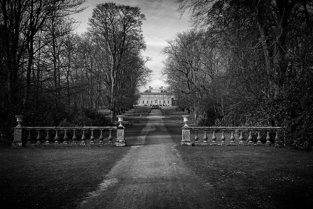
If lines are used well they draw your eyes to an interesting point in the photo, if they are used badly they just confuse the viewer.
- Has the rule of thirds been used?
There is no doubt that some photos look better balanced if this rule is obeyed. A single flower in the centre of a photo can just look lost, but place it off-centre at the intersection of the thirds and it will make a more interesting photo. That is not so say this rule always needs to be followed.
- Are there any distracting elements?
It often happens that objects ‘appear’ around the edges of the photo that would be better left out. It takes experience to always remember to look at the whole frame when taking a photo and to use a small depth of field to blur unwanted backgrounds.
Composition can often be improved by selective cropping.


SUBJECT MATTER
The final thing that can be considered is the actual subject matter itself.
- How does the photo make you feel?
- Does it tell a story?
- Do you want to look at it longer?

The bottom line is – do we have an interesting photograph that people want to look at.
By Annette Murty
–

Please leave a comment - we would love to hear from you.